
Start a Project
GOODMELT
Brand & Beyond + Print & Collateral
Goodmelt is a UK-based pizzeria built around real-life pizza moments, messy, indulgent, and made to be shared. Created for people who care less about perfect presentation and more about how it actually feels to eat, the brand celebrates late nights, good company, and unapologetically good food.
Built around bold flavours and a relaxed, personality-led approach, Goodmelt leans into the chaos of real pizza eating, cheese pulls, greasy fingers, and slices grabbed straight from the box. It’s less about dining, more about the moment.
TIMELINE
4 Weeks
DELIVERABLES
Brand Identity, Packaging, Social Assets


The Brief
Goodmelt came to us with a clear idea of how they wanted their brand to feel, fun, messy, and full of personality. Their early presence lacked consistency and didn’t reflect the experience they were trying to create. Our goal was to build a full identity that could bring that energy to life, creating something bold, recognisable, and easy to grow.
The Challenge
Too “Perfect” Pizza Culture
The category was dominated by polished, picture-perfect slices designed for Instagram. Goodmelt wanted the opposite, something real, messy, and unapologetically indulgent.
No Clear Visual Language
The personality existed in conversation, but not in execution. There was no system tying things together, making the brand feel inconsistent and forgettable.
Underused Packaging design
The pizza box was purely functional before, missing the chance to act as a key brand moment and part of the overall experience upon delivery.
The Solution
We built Goodmelt around warmth, humour, and unapologetic mess, creating a brand that feels as indulgent and real as the product itself.
Every element was designed to work together, from identity to packaging, building something bold, expressive, and instantly recognisable across every touchpoint.
Playful, chunky wordmark
A bold, slightly imperfect logotype that reflects the handmade nature of the food.
Mess-led visual language
Cheese drips, sauce splashes, developed into repeatable elements across packaging.
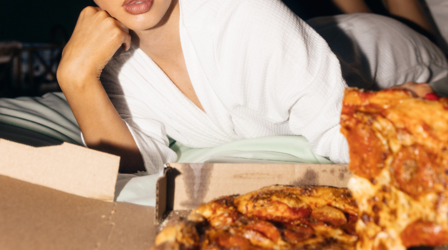
Photography that feels real
Focused on genuine pizza moments, hands grabbing slices, boxes mid-chaos.


Selected Work
A look at the brand in use across key touch points.


The Result
Goodmelt launched with a clear identity that people instantly connected with. The brand feels honest, indulgent, and unfiltered, offering something different from the polished pizza culture surrounding it. Socials quickly filled with messy slices, late-night orders, and real life, turning everyday purchases into organic content. Instead of competing with perfect, we carved out a space, one built around how pizza is actually eaten, hot, chaotic, and shared.
+85%
Increase in social shares and tagged content
2.7x
Growth in repeat orders and repeat visits.
2.3x
Increase in local brand recognition
The Brief
Goodmelt came to us with a clear idea of how they wanted their brand to feel, fun, messy, and full of personality. Their early presence lacked consistency and didn’t reflect the experience they were trying to create.
Our goal was to build a full identity that could bring that energy to life, creating something bold, recognisable, and easy to grow.
The Challenge
Too “Perfect” Pizza Culture
The category was dominated by polished, picture-perfect slices designed for Instagram. Goodmelt wanted the opposite, something real, messy, and unapologetically indulgent.
No Clear Visual Language
The personality existed in conversation, but not in execution. There was no system tying things together, making the brand feel inconsistent and forgettable.
Underused Packaging design
The pizza box was purely functional before, missing the chance to act as a key brand moment and part of the overall experience upon delivery.
The Solution
We built Goodmelt around warmth, humour, and unapologetic mess, creating a brand that feels as indulgent and real as the product itself.
Every element was designed to work together, from identity to packaging, building something bold, expressive, and instantly recognisable across every touchpoint.
Playful, chunky wordmark
A bold, slightly imperfect logotype that reflects the handmade nature of the food.
Mess-led visual language
Cheese drips, sauce splashes, developed into repeatable elements across packaging.
Photography that feels real
Focused on genuine pizza moments, hands grabbing slices, boxes mid-chaos.
Selected Work
A look at the brand in use across key touch points.


The Result
Goodmelt launched with a clear identity that people instantly connected with. The brand feels honest, indulgent, and unfiltered, offering something different from the polished pizza culture surrounding it.
Socials quickly filled with messy slices, late-night orders, and real life, turning everyday purchases into organic content. Instead of competing with perfect, we carved out a space, one built around how pizza is actually eaten, hot, chaotic, and shared.
+85%
Increase in social shares and tagged content
2.7x
Growth in repeat orders and repeat visits.
2.3x
Increase in local brand recognition
GOODMELT
Brand & Beyond
+ Print & Collateral
Goodmelt is a UK-based pizzeria built around real-life pizza moments, messy, indulgent, and made to be shared. Created for people who care less about perfect presentation and more about how it actually feels to eat, the brand celebrates late nights, good company, and unapologetically good food.
Built around bold flavours and a relaxed, personality-led approach, Goodmelt leans into the chaos of real pizza eating, cheese pulls, greasy fingers, and slices grabbed straight from the box. It’s less about dining, more about the moment.
TIMELINE
4 Weeks
DELIVERABLES
Brand Identity, Packaging, Social Assets